AQA A-Level Economics | 10 Mark Question
How to answer the 10 mark question
- make 3 points in relation to the statement provided in the question
- each point should contain
- any argument that could answer the question
- data to back up your point
- show off your analysis/ chains of reasoning/ knowledge/ links
- (quick) limitations of relying on that data
- judgement - whether or not the statement is true
Specimen
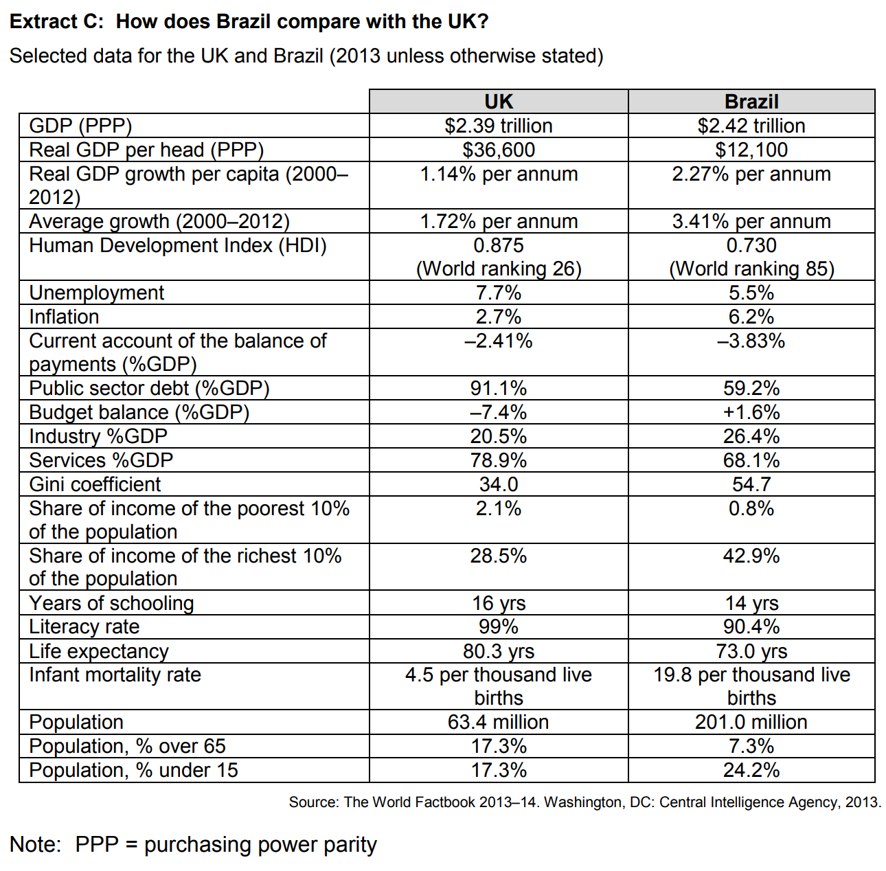
How does Brazil compare with the UK in relation to human capital and macroeconomic stability? You must use the data in Extract C to support your assessment.
June 2017
To what extent, if at all, do you consider that the UK manufacturing sector has been in decline since 2003? You must use the data in Extract B to support your assessment.
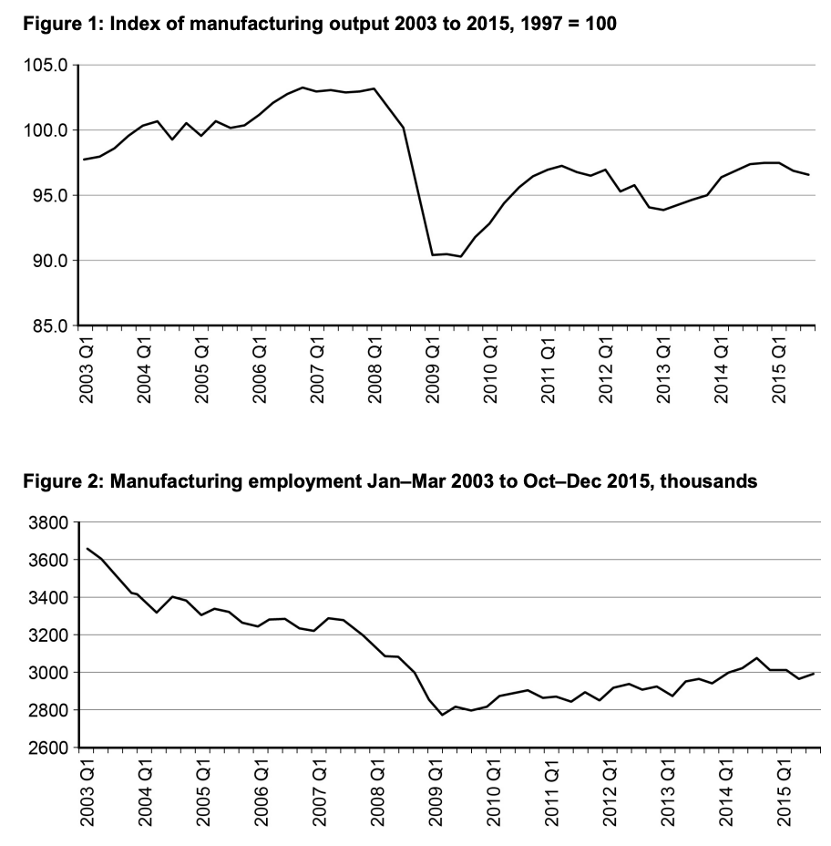
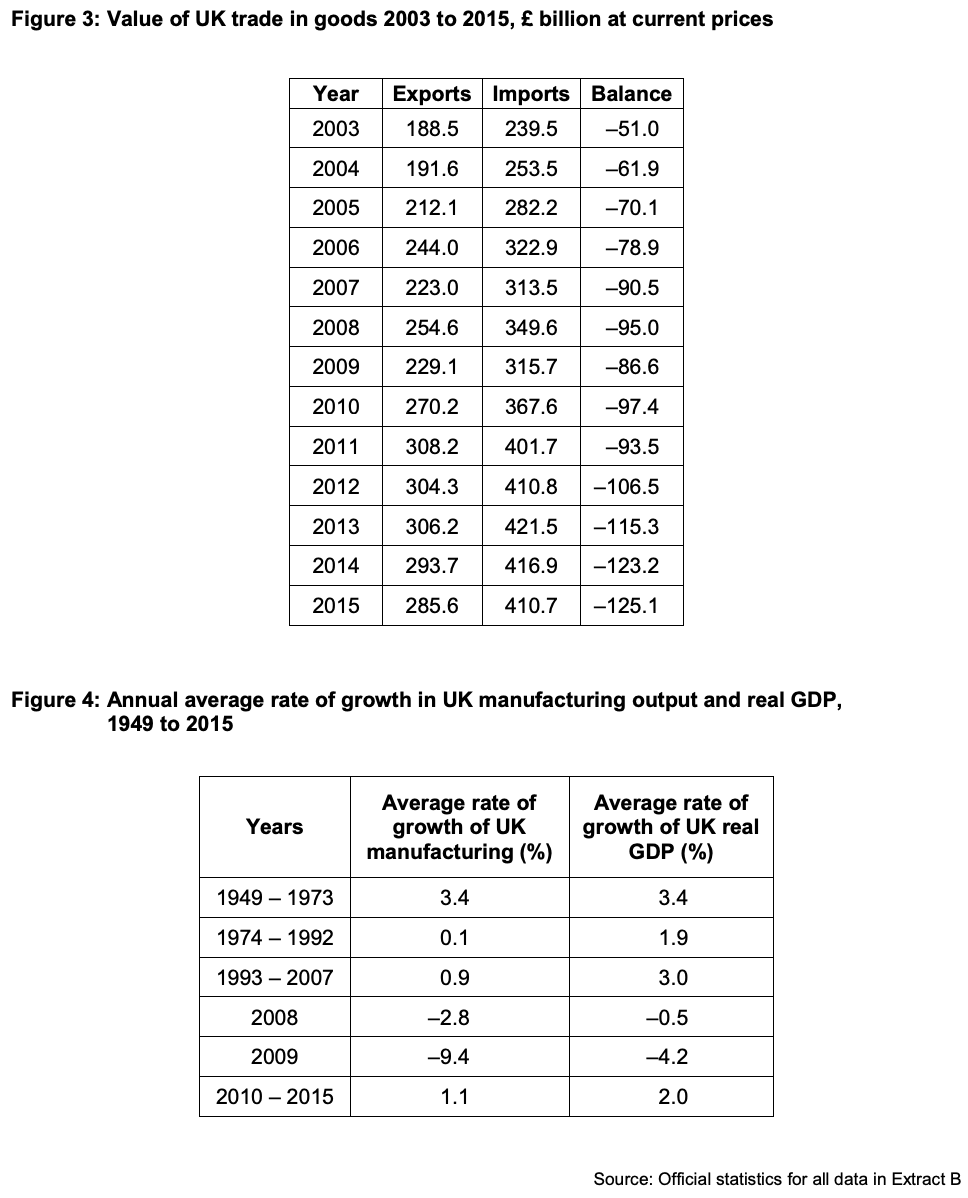
Figure 4 shows that the average rate of growth of the UK manufacturing sector declined in 2008 by -2.8% and by -9.4% in 2009 and only recovered by 1.1% from 2010-2015. This data suggests that the UK manufacturing sector declined. However, you could evaluate this as the entire UK GDP declined in 2008 and 2009 and there was a financial crisis then too. Also, the data is grouped weirdly so one of the groups starts from 1993 so we do not have good data for the years 2003-2007, so it may be difficult to suggest that the manufacturing sector has declined overall since 2003.
Figure 2 shows the employment rates in the uk manufacturing industry from 2003 to 2015. Employment in this sector has experinced decline. There was around 3,650,000 jobs in the manufacturing industry in the first quater of 2003 which went on to fall to 3,000,000 jobs in the first quarter of 2015. However this does not neceserially show a decline in the industry. Jobs in the uk manfufacturing industry may have been replaced by capital (machines).
Figure 1 also shows that the manufacturing sector may have declined as the index of output has gone down from around 98 to 96. I could evaluate this by saying that it has gone by a small amount (an index number of 1) and also there have been many fluctuations in between 2003 to 2015. For example, if we only look at the graph from Q3 2009, the index has gone up, so if it was to continue at this rate, the manufacturing would recover.
Overall, despite some limitations in the data, I would conclude that the manufacture sector in the UK has declined but not by much.
June 2018
To what extent, if at all, do the data suggest that the reliance on fossil fuels to produce energy is falling? You must use the data in Extract C to support your assessment.
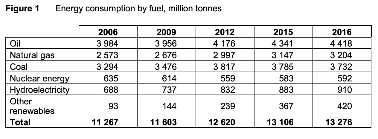
Demand is the number of goods and services that people are willing and able to buy at each price. An increase in demand could suggest there is more reliance on something. Oil, coal and natural gas are fossil fuels. Figure 1 clearly suggests that the reliance of fossil fuels to produce energy is not falling. The consumption of oil has increased from 3984 million tonnes in 2006 to 4418 million tonnes in 2016. The same happened with coal and natural gas usage. Coal use increased from 3294 million tonnes in 2006 to 3732 million tonnes in 2016.
However, the data doesn't clearly suggest that we are becoming more reliant on fossil fuels. This is because the consumption of other types of fuels also increased. In particular, there was a large increase in the usage of hydroelectricity and other renewables in the same time period.
Secondly, since 2011, the price of oil and coal has fallen. This suggests....
June 2019
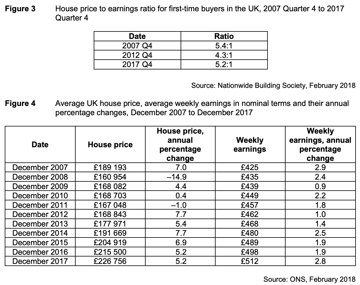
To what extent, if at all, do the data suggest that houses in the UK were more affordable in 2017 than they were in 2007? You must use the data in Extract C to support your assessment.
THIS IS A MODEL ANSWER FROM TUTOR2U
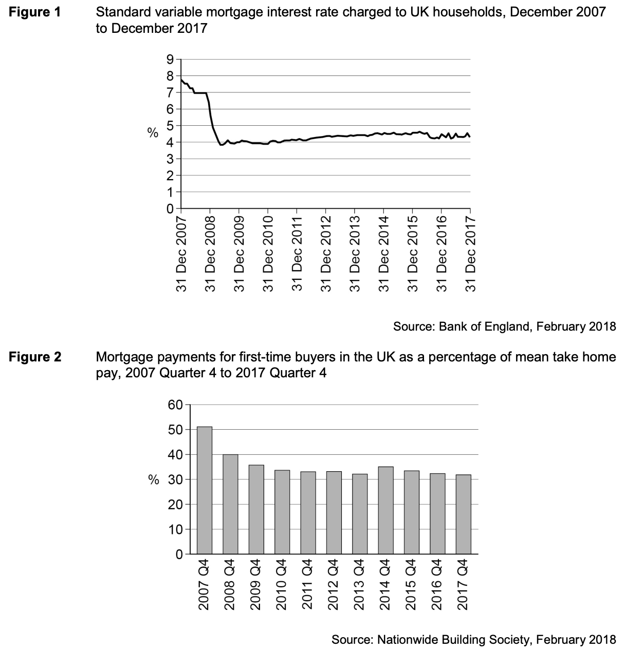
“Most owner occupiers finance the purchase of their house by borrowing, using a mortgage” – Extract A line 3. In this case any deposits required at the start and the monthly payments and how this compares with disposable income in particular will influence affordability. Figure 3 shows the house price to earnings ratio for first time buyers in the UK. This is the group most likely to be impacted by affordability because they have to save for their deposit. In Q4 2007, the ratio stood at 5.4:1 but by Q4 2017, it had fallen to 5.2:1. On the face of it, this suggests that all else equal, affordability has actually improved. It seems unlikely though that all else is equal. The impact of the financial crisis is that lenders are more cautious making loans and that a bigger % of the value of a house is likely to be required as a deposit. This is likely to more than offset any small difference in the ratio. For house buyers more generally, “today the median price of a house is almost eight times median earnings, an all-time record” – Extract B lines 1 and 2. The extract is dated 2017 and if it is an all time record suggests less affordability generally than in 2007, although there is insufficient information presented in the extract to judge the extent.
Another factor influencing affordability will be the interest rate actually charged for mortgages. Figure 1 shows a significant fall from a little over 7½% standard variable rate in December 2007 to around 4¼% in December 2017. On the face of it, this suggests improved affordability but much will depend on what has happened to incomes over the same period. For first time buyers, figure 2 indicates that mortgage payments for first-time buyers in the UK as a percentage of mean take home pay has improved by 19 % points from 51% in Q4 2007 to 32% in 2017. This suggests improved affordability. It would be useful though to have some indicator of dispersion around the mean and also of other essential expenditures, such as energy. Also this information shows those who were able to make a purchase. Anyone outside of this group, for whom house purchase was unaffordable, would not be included.
Figure 4 shows information on average house prices and average weekly earnings. This may give a more complete picture of affordability. From end 2007 to end 2017, house prices on average rose by 19.85% and weekly earnings by 20.47%. This suggests that affordability may be broadly unchanged. However, the figures shown are nominal. Allowing for inflation around the target rate of 2% would suggest real earnings were very little changed, and possibly lower. This changes the conclusion on affordability and suggests on average it may well have worsened. It may well be too that disaggregated data would show significant differences on a regional basis for example that would be of concern to policy makers.
Only to a limited extent is it possible to conclude that houses in the UK were more affordable in 2017 than they were in 2007 and in fact the balance of the information provided suggests the opposite. Disaggregated data, were it available, may well suggest this is especially so for certain groups.
June 2020
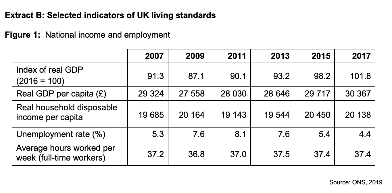
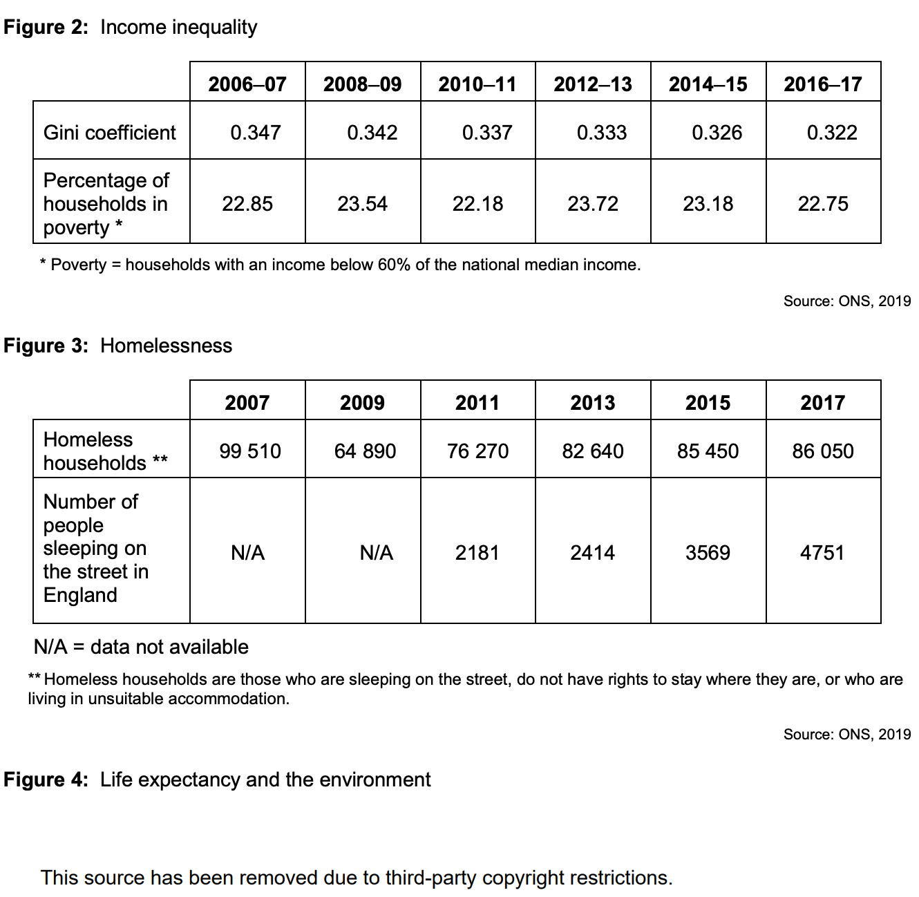
To what extent, if at all, do the data suggest that living standards in the UK improved between 2007 and 2017? You must use the data in Extract B to support your assessment.
June 2021
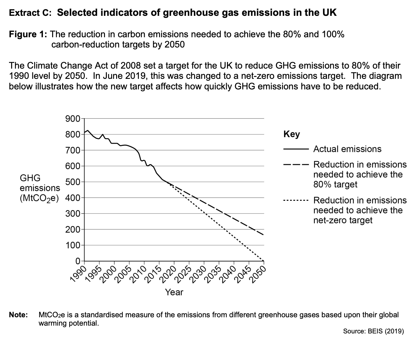
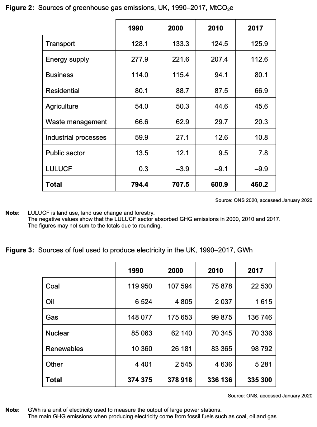
The UK government has set a target to reduce net greenhouse gas (GHG) emissions to zero by 2050.
To what extent, if at all, do the data suggest that to achieve its net-zero emissions target, the government should focus on reducing GHG emissions from the transport sector? You must use the data in Extract C to support your assessment.
June 2022
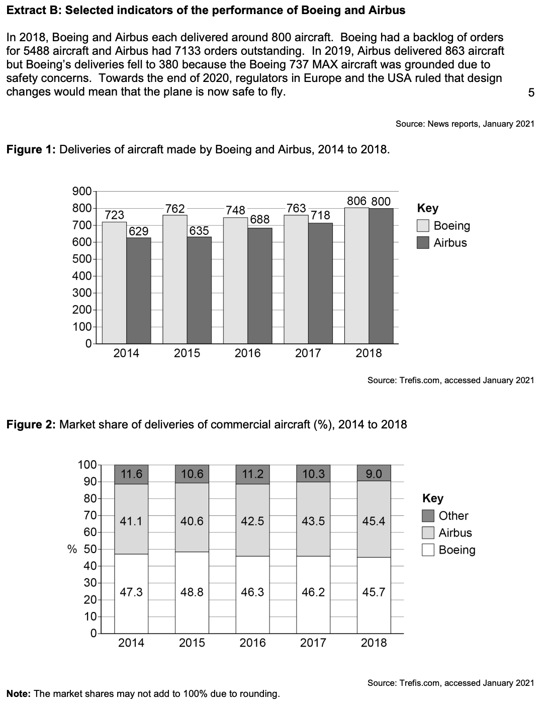
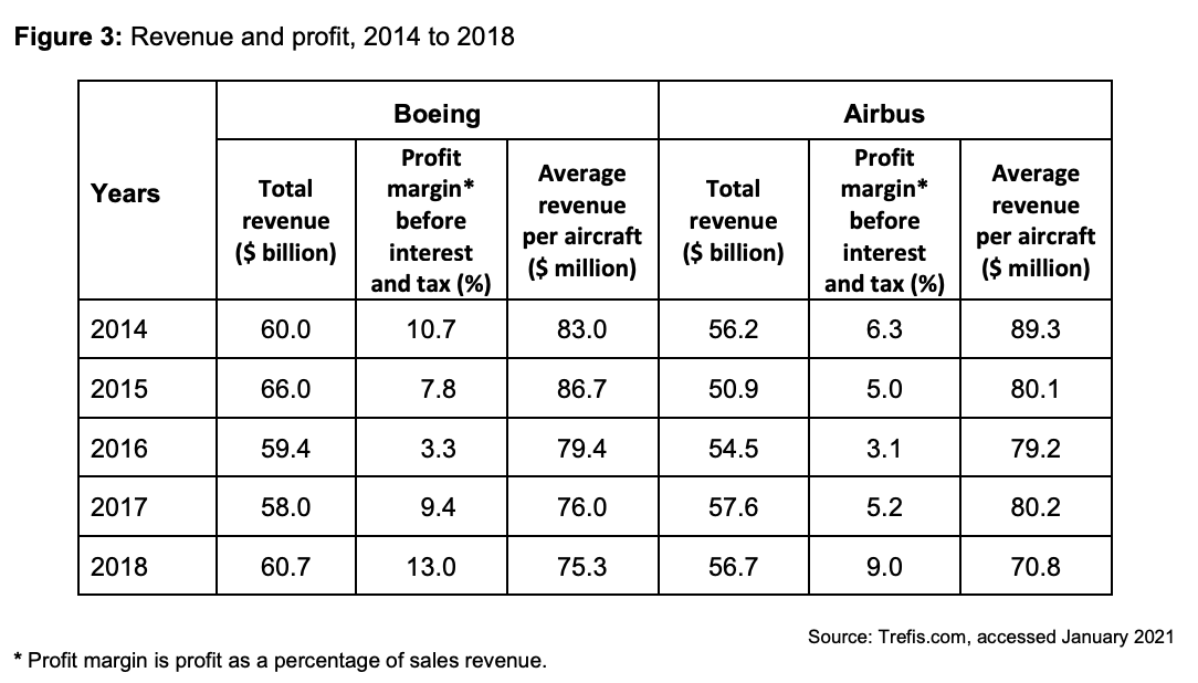
To what extent do the data support the view that Boeing has been more successful than Airbus since 2014? You must use the data in Extract B to support your assessment.
June 2023
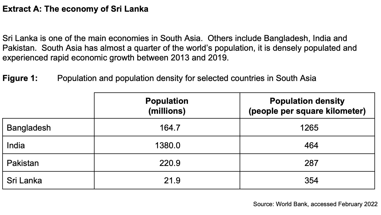
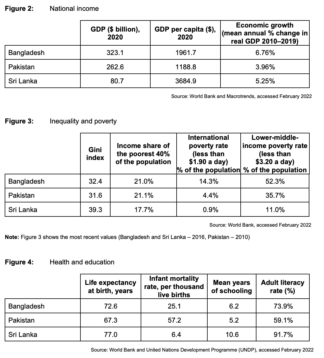
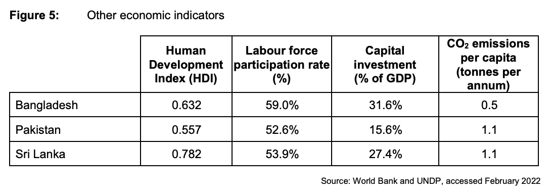
To what extent, if at all, do the data suggest that the Sri Lankan economy is more economically developed than the economies of Bangladesh and Pakistan?
June 2024
To what extent, if at all, do the data suggest that people living in the South East (SE) of England are better off than people living in the North East (NE) of England?